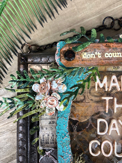
Hello! And welcome to my first blog post! I love browsing other crafty blogs, and I've been toying with the idea of my own for a while now and this felt like a good project to kick it off with. I'm excited to use this space to give a little more explanation of my creative process and this was a fun one, so let's dive in to how I made it!
The Inspiration + Early Concept...
As spring is in full effect, I knew I wanted to make something that included a lot of greenery and wanted to use this phrase I saw in the Tiny Text stamp set, Don't Count the Days, Make the Days Count, which also inspired me to sprinkle in some little counting/numerical details (it's those little details that are always the most fun for me).
I snapped this photo when I was just playing around with the initial idea and trying to get a better feel for the layout.
The Frame + Hanger...
I started with the Framed Panel (decided to only use the frame and save the base panel for a future project) and applied some random grit paste. Once dry, I coated the frame entirely with Walnut Stain distress paint. Then I used my finger to add Antiqued Bronze Distress Stain to highlight the raised grit paste texture and frame details. Next, I added Ranger's Caramel alcohol ink to four of the smaller hardware heads and secured to each corner of the frame.
For the hanger, I used two screw eyes from the Vignette Hardware Findings pack, inked with Caramel and twisted into the top edge of the frame. Then I removed the 'swivels' from four swivel clasps (just wanted the chains) and used a few jump rings to connect them together before inking with Caramel and attaching to the screw eyes.
The Background...
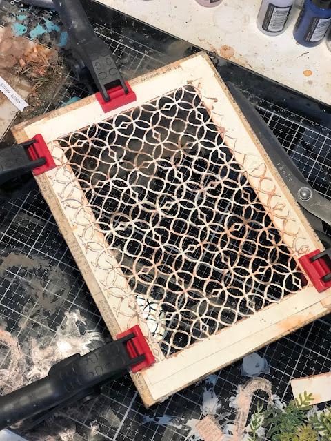
I loved the idea of having a little transparency in the background of the frame, so I cut the Pattern Repeat thinlit die from Mixed Media Heavystock paper, making sure the pattern would entirely fill the frame (even though a lot of it ends up getting covered later). I added grit paste to the pattern cutout, and once it was dry, coated with Antiqued Bronze distress stain.
I wanted a little more of a border inside the frame, so I put some strips of design tape down on heavystock (I think this particular tape of Tim's is discontinued now), added a wash of Antiqued Bronze stain, and cut out the strips. (Love this part, but it ends up almost entirely covered and unnoticeable in the end... oh well, still so fun!)
You can see the strips a little better in the photo below... and this photo shows the grit paste covering my small frame and ledge before I added paint, more on that ahead. (I usually change my mind quite a bit throughout my projects, so you'll notice things (or colors) in early stage photos don't end up in the final piece!)
In the next photo, you can see how I glued the design tape + pattern cut out to my frame and clamped until dry (when my glass mat/counter is this messy, it usually means I'm really in the ZONE :)
Next, I wanted to create a few unique papers to add to the corners. I stamped a small piece of heavystock with the numbers stamp from the set Faded Type (CMS397) in Walnut Stain Distress ink and added a light wash of Vintage Photo distress paint to help grunge it up.
Then I found a piece from the Collector ephemera layers pack with numbers and days of the week, tore it to fit my corner, added a few splotches of Antiqued Bronze stain, and inked the edges. (Love the rough and random look of torn papers with raw edges combined with the crispness of the die cuts!)
For the darker piece on the left edge, I cut a little more of the pattern repeat die and stuck down on plain heavystock with matte medium. I used my finger to rub grit paste over the raised pattern and let dry, then painted the whole piece with Walnut Stain. I knew I wanted to add a color to the raised pattern to help contrast the Walnut Stain but after trying Evergreen Bough, I changed my mind and used Antiqued Bronze instead. I tore half of this piece for the background and used the other half to cut one of the larger Bottled Up bottles.
The Ledge...
For the ledge the bottles will sit on, I first used two plain bracket trim pieces to prop up the metal ruler from the Ideaology Findings set, securing all in place with Collage Medium.
The Small Frame + Sentiment...
Using the same steps as the ledge pieces, I gussied up a small Ideaology lace baseboard frame. I cut a piece of clear acetate to fit behind the frame, splotched on some caramel alcohol ink and adhered with matte medium. I also stamped the first part of the phrase, Don’t count the Days, from the Tiny Text set (CMS394), along with the numbers dial stamp from The Professor set (CMS373), onto some clear acetate with Versamark clear emboss ink. Then sprinkled Ranger’s white embossing powder over the top and embossed with my heat tool. (While the acetate is heat-resistant, I still try to be quick or it will eventually start to twist up a bit.)
I knew I wanted to top edge to rest on the larger frame, so I needed a way to prop up the bottom, which gave me the idea to glue two hitch fasteners behind the bottom corners to help give it some lift.
Next, I cut out the acetate piece with my stamped phrase by hand. I positioned the smaller scalloped circle from the labels die set over my embossed dial stamp and cut out my shape. I added a small amount of Caramel ink over the white embossing on both the phrase and dial to give them a grungy wash.
I cut the larger label strip from the Labels (660060) die set and another of the smallest scalloped circle from heavystock paper. I added grit paste to both, let dry, and then colored with Antiqued Bronze stain before placing under my stamped pieces.
I added caramel alcohol ink to 6 hardware heads, placing two under my Don't Count the Days label to lift it off the frame a bit, then two more on the top corners of the label and two in the bottom corners of the frame.
Next, I added Caramel ink to an index clip fastener, the little clock from the mini flare set, a mini gear, and another hardware head, and nested together in the lower center with my stamped dial. I added the "Lesson 175" clipping from the Clippings Sticker Book above my phrase.
For my "Make the Days Count" letters in the center of my frame, I used Tim’s Alphanumeric Labels font set. I like them a little thicker, so I cut 3 of each letter and glued together (sometimes they aren't perfectly aligned, but that's ok with me! And I find adding an extra topcoat of Collage Medium helps hide most of the imperfections.) Once I was happy with the thickness, I coated them all with a light wash of Antiqued Bronze stain and let dry before gluing to the clear acetate.
The Bottles...
For the vertical ‘metal’ bottle, I first embossed a small piece of Mixed Media Heavystock paper with the Foundry 3D texture fade (be sure to dampen the paper a bit before embossing for the best imprint!). Then used this piece to cut one of the medium-sized bottles from the Bottled Up Bigz die. I went ahead and painted it but decided I wanted to create a little more depth so I embossed another small piece of heavystock and cut out a few of the sections that lined up with my bottle and glued them over the top. I then added some of the small hardware head brads (clipping the brad part off) and rubbed grit paste over the whole bottle. Next I coated with Antiqued Bronze stain, then used Caramel ink to go over my hardware and ‘rivets’ for extra depth.
For the bottle laying down, which I’ve already cut from my background paper, I just needed to add a few more details to finish off. I cut a couple strips off the bottom of my vertical bottle because I knew it would be hidden, and added them to my darker bottle, along with a couple more hardware head brads (snipping off the brad part) to help make them look more coordinated.
The Greenery...
So many green things! I glued the Typeset collage paper down on 3 half-pieces of heavy stock, and painted each with a different green base, forest moss, peeled paint and mowed lawn. Then used my emboss dabber to make some random swipes and sprinkled on my green glazes, in peeled paint and rustic wilderness, before using my heat tool to set. Then I went to town cutting my greenery from the Funky Florals 1 dies.
I wanted it to look like my greenery was coming out of my bottles, or behind them, so I glued most of the greenery first, before securing my bottles over the top.
The Flowers...
For the flowers, I glued strips of design tape on to a piece of heavystock, then I used Versamark to stamp a design from Tim's Tapestry set over the whole piece. I wanted a little variation, so on one half, I covered it with Ranger's white embossing powder and on the other half, Antique Linen embossing powder, then set all with a heat tool. I used the Funky Florals 1 die set to cut as many flowers as I could fit on the paper, then shaped, assembled and glued.
I also found a numbered piece from the Collector ephemera layers pack that inspired me to cut a few accent flowers and also add some numbered strips along the edges of my frame.
The Finishing Touches...
I added the number 2 from the Ideaology Odds and Ends Embellishments set, a few random number strips, calendar ephemera pieces, and bits of moss here and there (a great way to cover up any imperfections and just tie everything together). I also like to go back and add some extra alcohol ink around most of my hardware heads or metal bits.And there you have it! Please feel free to leave a comment or email me if there's something you're curious about that I didn't cover, always happy to talk craftiness!
Thanks so much for stopping by!
x Erin
Distress Stain: Antiqued Bronze
Alcohol Ink: Caramel
Distress Ink: Walnut Stain
Ideaology: Odds and Ends Embellishments, Hardware Heads, Swivel Clasps, Mini Fasteners Brads Screws Hardware, Mini Flare Embellishments, Mini Gears Sprockets, Ruler Pieces Findings, Typeset Collage Paper, Vignette Hardware Findings, Lace Baseboard Frames, Jump Rings Hardware, Hitch Fasteners, Clippings Sticker Book, Collector ephemera layers, Index Clip Fasteners
3D Texture Fade: Foundry
Other: moss, design tape, Glass Mat, Big Shot


This is outstanding! Just found your blog via IG and I have been pouring over your two posts. Your makes are amazing and I love your grungy style. I am also a Tim Holtz junkie, hopelessly addicted. I appreciate how thorough and detailed your posts are, and the photos are also super helpful. I’m looking forward to seeing what you come up with next.
ReplyDeleteThis makes my heart so happy! Thank you for taking the time to browse and leave such a sweet note, it's inspiring beyond words! x Erin
Delete